Evolving Fresh Relevance’s visual identity
Part 1: Logo
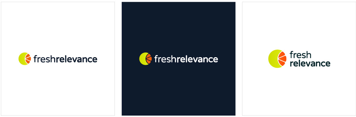
Fresh Relevance (now Dotdigital) was a digital marketing company that offered cross-channel personalised experiences for eCommerce customers. I was brought in to redesign the existing logo, which had been previously developed in 2017 by an external agency and had trademark issues. The brief required a rapid logo redesign under existing constraints that would improve consistency and usability.
I looked to retain recognisable elements of the existing identity while improving clarity and strengthening brand recognition alongside a newly designed website. To address issues present in the previous iteration, such as excessive kerning and a complex 9-colour palette, I developed a simplified icon centred around a chart, symbolising segmentation. The colour palette combined with the icon evoked a ‘fresh’ feel, while the accompanying font was chosen for legibility and approachability.
This project became the foundation for my long-term ownership of the Fresh Relevance visual brand identity, which I continued to evolve and refine over the years.
Client
Fresh Relevance
Deliverables
Logo design & visual identity
Brand guidelines
Templates & redesigned collateral
Software
Adobe Illustrator
Adobe InDesign
Adobe Photoshop
Adobe After Effects

Part 2: Brand evolution & exploration
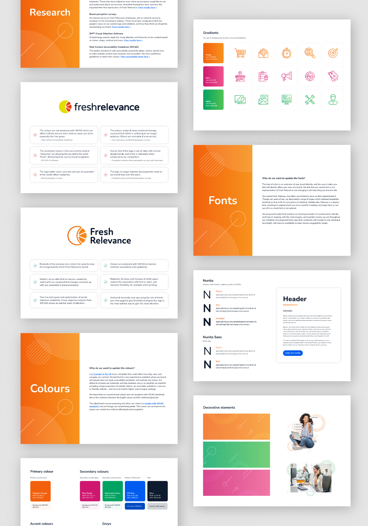
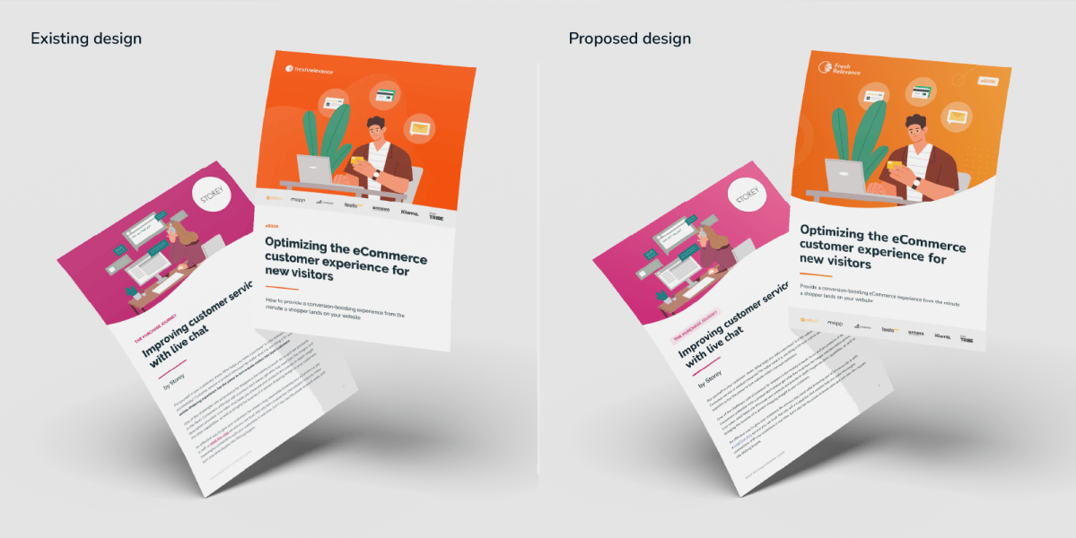
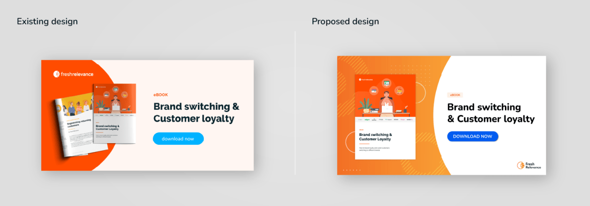
Several years later, I led a strategic brand refresh to ensure Fresh Relevance’s identity aligned with modern aesthetics and remained up-to-date. I created a proposal for the leadership team outlining recommended changes, informed by research into the existing brand, user expectations, internal employee feedback and competitor analysis.
The refresh involved:
- Fine-tuning the existing colour palette to improve usability, and introducing additional colours to expand flexibility and appeal. I collaborated closely with the UX designer to ensure alignment with web standards.
- Developing a new imagery direction to effectively showcase the product.
- Collaborating with the content marketer to establish a cohesive brand voice across both visual and written collateral.
- Updating typography to better align with the newly defined brand voice.
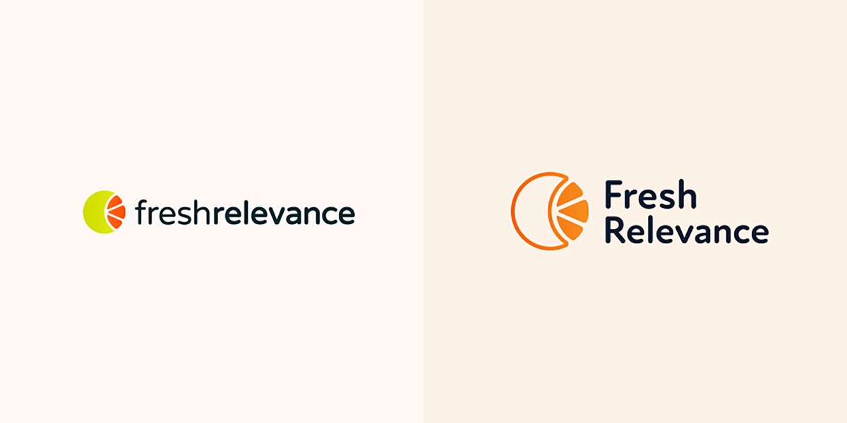
Logo Exploration
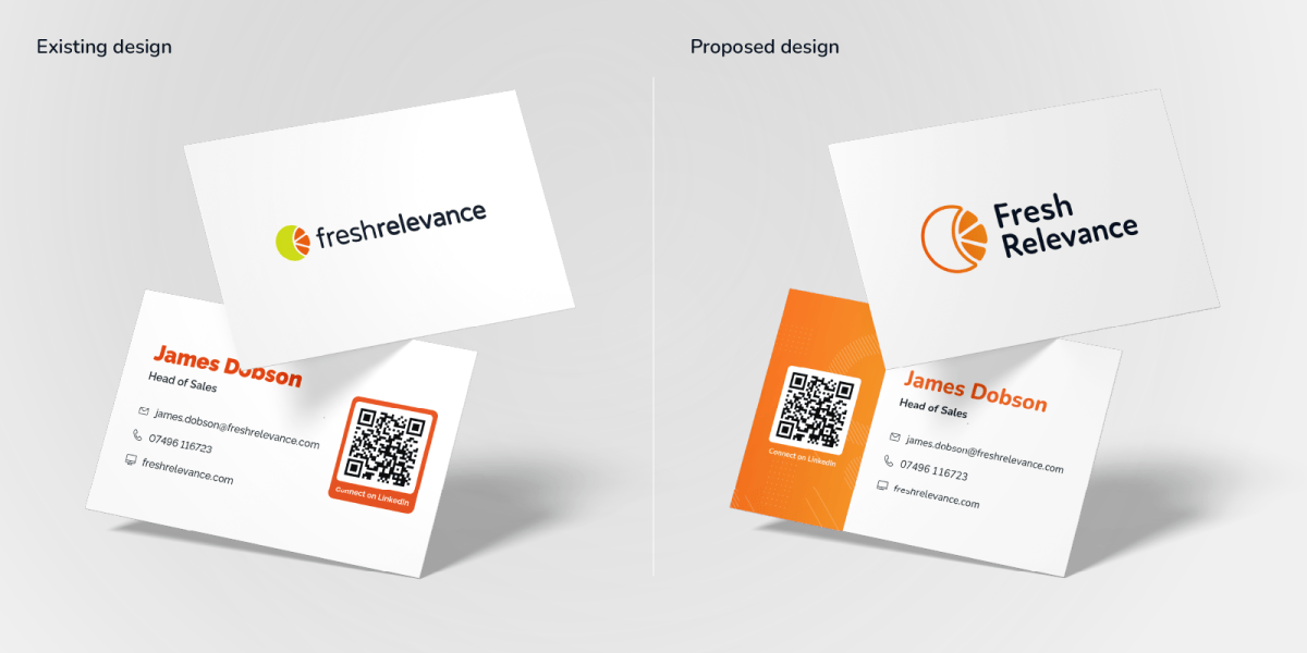
As part of the refresh, I explored a modernised logo concept to complement the updated visual identity. The design aligned with the refined palette and typography, improving scalability and readability across digital and print. The concept introduced a subtle modernisation while remaining recognisable to existing users, and was positively received by internal stakeholders.
While the final rollout retained the original logo, this exploration demonstrates my approach to strategic concept development and highlighted a potential direction for future brand evolution.
Part 3: Rollout and implementation
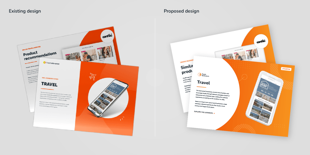
Following approval of the refreshed identity, I proceeded to develop a set of brand guidelines. The refreshed system was then implemented across a wide range of company collateral, ensuring consistency across all touchpoints. I also created a suite of templates for our most used assets to support long-term adoption across teams.

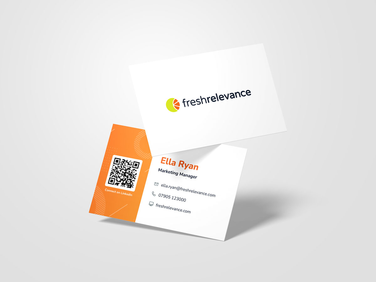
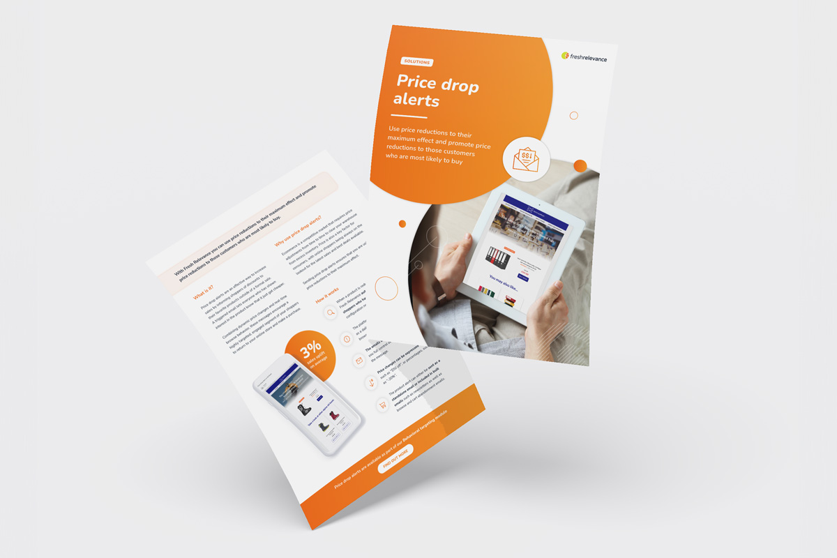

You can see a selection of projects which apply the Fresh Relevance branding here:

Interactive Lookbooks

Predictions eBook

Loyalty eBook & report
Results
The redesign had a lasting impact, with the logo becoming a recognisable symbol of the company’s identity within the digital marketing industry. Its strong visual presence helped reinforce brand recognition and credibility over several years.
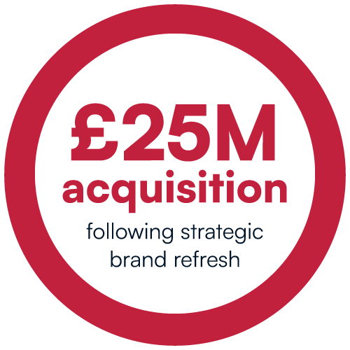
The refreshed branding introduced a more engaging and contemporary identity, positioning Fresh Relevance more effectively in the marketplace. This evolution enhanced the brand’s professional image, and it was acquired by a leading marketing technology company shortly after for £25 million.
Discover more projects

Laure W Peniture visual identity
Fresh Relevance loyalty eBooks
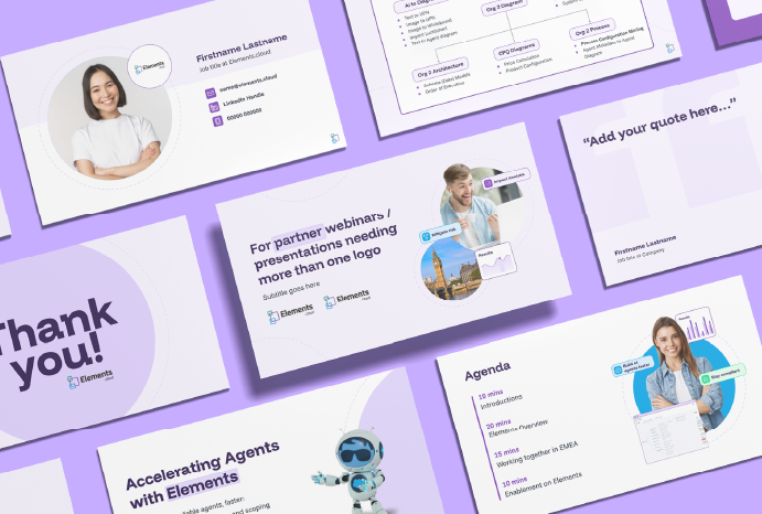
Elements.cloud templates